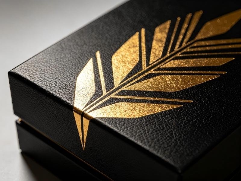
1. Why Color Consistency Matters
Color is one of the fastest-recognized brand assets — think of the specific blue or red you associate with major brands. If your box, pouch and tissue each render your brand color slightly differently, the set looks cheap and uncoordinated even if each piece is well made. Color control is what makes a multi-piece packaging set feel like one brand.
2. What Pantone Is
The Pantone Matching System (PMS) is a standardized library of pre-mixed spot-color inks, each with a code (e.g., "Pantone 186 C"). Because everyone references the same physical swatch, "Pantone 186 C" means the same color to your designer, us, and any other supplier — removing guesswork from color communication. The "C" means coated stock; "U" means uncoated, and they look different.
3. Spot Color vs CMYK
| Spot (Pantone) | CMYK (Process) | |
|---|---|---|
| How | Pre-mixed single ink | 4 inks blended in dots |
| Consistency | Very high | Can vary run to run |
| Best for | Solid brand colors, logos | Photos, gradients, full-color art |
| Cost | Setup per spot color | Economical for full color |
For a solid brand color you want identical every time, spot color is the reliable choice. CMYK is for photographic or full-color artwork, but reproducing a precise brand color in CMYK can drift between runs.
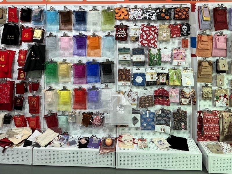
4. Why Color Shifts by Material
The same Pantone ink looks different on different surfaces — this surprises many first-time buyers. A color on glossy coated card, matte uncoated kraft, and fabric will each read slightly differently because the surface absorbs and reflects light differently. On fabric pouches, color is matched by dyeing or printing to a reference rather than by ink code, so expect a close match, not a pixel-perfect one. Textured and kraft materials mute and warm colors; bright white coated stock shows them truest.
5. How to Lock In Your Color
- Provide your Pantone code(s), not just a screen RGB/hex value (screens lie).
- Specify coated (C) or uncoated (U) to match your material.
- Request spot color for solid brand colors where budget allows.
- Ask for a matched physical sample on each material in your set.
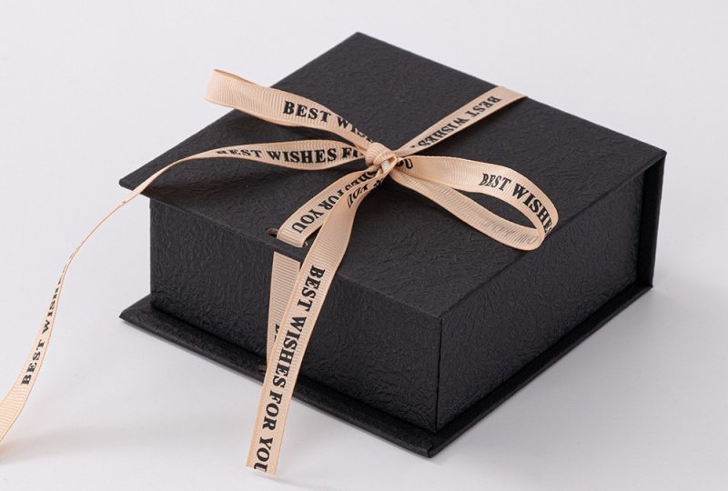
6. Proofing & Approval
Always approve color on a physical proof, not a screen — monitors vary wildly and can't show spot inks or material interaction. We produce a pre-production sample with your matched color on the actual material; you approve it (ideally against your physical Pantone chip in daylight) before we run production. This single step prevents the most expensive packaging mistake there is: a full run in the wrong shade.
Frequently Asked Questions
What is Pantone color matching in packaging?
Pantone (PMS) matching uses a standardized library of pre-mixed spot-color inks, each with a code like "Pantone 186 C." Because everyone references the same physical swatch, your brand color means the same thing to your designer and the factory — removing guesswork and keeping color consistent across a packaging set.
Why does my brand color look different on different packaging?
The same ink reflects differently on different surfaces — glossy coated card, matte kraft and fabric each render a color slightly differently. On fabric pouches, color is matched to a reference by dyeing/printing, giving a close but not pixel-perfect match. Always approve a physical sample on each material.
Should I use spot color or CMYK for my brand color?
Use spot (Pantone) color for solid brand colors and logos you need identical every run — it's the reliable choice. Use CMYK (process) for photographic or full-color artwork. Reproducing a precise brand color in CMYK can drift between runs, so spot is safer for brand consistency.
How do I make sure my packaging color is correct?
Provide a Pantone code (not just a screen hex value), specify coated or uncoated to match your material, request spot color for solid brand colors, and approve a physical pre-production sample on the actual material — ideally checked against your Pantone chip in daylight — before mass production.
Get a Custom Quote in 24 Hours
Free samples, free artwork mock-up, MOQ from 100 pieces. Factory-direct from Xiamen since 2014.